Disability Rights and the International Symbol of Accessibility
http://www.huffingtonpost.com/lisa-wade/disability-rights-and-the_b_2696984.html (ขนาดไฟล์: 0 )
Justin J.W. Powell and Liat Ben-Moshe have written a great short history of the icon signifying accessibility for people who use wheelchairs for the magazine Stimulus Respond. The story, they argue, is one of "exclusion to inclusion."
For most of American history, they begin, there was no icon at all. This is because people in wheelchairs were largely excluded from public life. There were no efforts to ensure accessibility, so no signs of accessibility were needed.
In the late '60s, however, Rehabilitation International partnered with the United Nations and the International Standards Organisation to sponsor an international competition for an icon. The winner, a Danish design student named Susanne Koefoed, had submitted the icon on the left. In committee, they noted that Koefoed's design erased the person in the wheelchair. They added a head, creating what people around the world recognize as a symbol of accessibility.
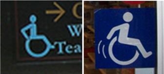
The symbol is still evolving. Powell and Ben-Moshe note that recent revisions have been aimed at emphasizing that people in wheelchairs are active users, not passive ones. Accordingly, some organizations have shifted to using a symbol that captures the fact that people in wheelchairs get themselves around. I've snapped pictures of the icons used by the Huntington Gardens and a T.J. Maxx (both in CA): the former has the users' arms bent behind them to signify pushing their chair forward, while the latter leans the figure forward and adds motion lines.
Ultimately, Powell and Ben-Moshe hope that access will be so universally designed into public buildings that it will eliminate the need for an icon at all: architecture would no longer be designed around a specific type of person considered "normal," but instead would be designed for the range of people who will use the spaces. This full integration would mean that differently-abled people would be considered just "people" and we wouldn't need an icon at all.
Originally posted at Sociological Images.
Lisa Wade is a professor of sociology at Occidental College and the principle writer for Sociological Images. You can follow her on Twitter and Facebook.
For more by Lisa Wade, click here.
ที่มา: http://www.huffingtonpost.com/lisa-wade/disability-rights-and-the_b_2696984.html (ขนาดไฟล์: 0
)
วันที่โพสต์: 8/03/2556 เวลา 03:13:43 
![]()
![]()
แสดงความคิดเห็น
รายละเอียดกระทู้
Disability Rights and the International Symbol of Accessibility http://www.huffingtonpost.com/lisa-wade/disability-rights-and-the_b_2696984.html Justin J.W. Powell and Liat Ben-Moshe have written a great short history of the icon signifying accessibility for people who use wheelchairs for the magazine Stimulus Respond. The story, they argue, is one of "exclusion to inclusion." For most of American history, they begin, there was no icon at all. This is because people in wheelchairs were largely excluded from public life. There were no efforts to ensure accessibility, so no signs of accessibility were needed. In the late '60s, however, Rehabilitation International partnered with the United Nations and the International Standards Organisation to sponsor an international competition for an icon. The winner, a Danish design student named Susanne Koefoed, had submitted the icon on the left. In committee, they noted that Koefoed's design erased the person in the wheelchair. They added a head, creating what people around the world recognize as a symbol of accessibility. The symbol is still evolving. Powell and Ben-Moshe note that recent revisions have been aimed at emphasizing that people in wheelchairs are active users, not passive ones. Accordingly, some organizations have shifted to using a symbol that captures the fact that people in wheelchairs get themselves around. I've snapped pictures of the icons used by the Huntington Gardens and a T.J. Maxx (both in CA): the former has the users' arms bent behind them to signify pushing their chair forward, while the latter leans the figure forward and adds motion lines. Ultimately, Powell and Ben-Moshe hope that access will be so universally designed into public buildings that it will eliminate the need for an icon at all: architecture would no longer be designed around a specific type of person considered "normal," but instead would be designed for the range of people who will use the spaces. This full integration would mean that differently-abled people would be considered just "people" and we wouldn't need an icon at all. Originally posted at Sociological Images. Lisa Wade is a professor of sociology at Occidental College and the principle writer for Sociological Images. You can follow her on Twitter and Facebook. For more by Lisa Wade, click here.
จัดฟอร์แม็ตข้อความและมัลติมีเดีย
รายละเอียดการใส่ ลิงค์ รูปภาพ วิดีโอ เพลง (Soundcloud)


